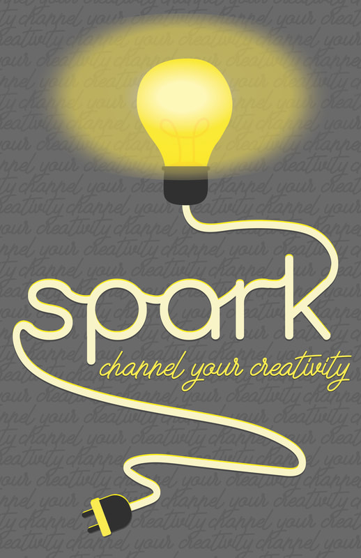
Creating art for the Spark show was arguably one of the most enjoyable things I've done this semester in school! I had so much fun planning and executing this design. One of the biggest challenges of this was being able to spice up the idea I had in my head without it overpowering the work or detracting from the focal points. It was also more difficult than expected to redesign it for to fit a square ratio! Overall creating this work really challenged my way of thinking and interpreting concepts. I feel so incredibly accomplished after this semester though. I've had so much fun, thank you for everything Mrs. Guss!!
1 Comment
Yesterday my partners both said that they liked my layout and design overall! One of them really appreciated how the font gave Christmassy vibes. They thought that it looks like I put a lot of time and effort into this project. I would probably to to line up the snow/sky lines more evenly to create more of a flow in the final image. I also could make the font a little bigger so it spills off the circle a little to connect the shapes more.
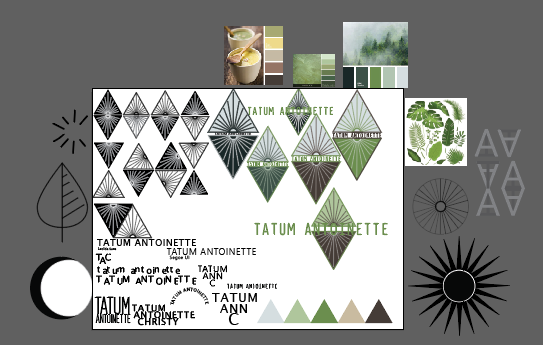
I am generally pretty happy with my logo and identity! The more I am working with the design I am considering tweaking the color scheme and/or which colors are more prominent in the identity rules. This is not anything like what I first was set on! I am so grateful that for making a Pinterest board because it really helped me expand my horizons. I was super into the idea of making a logo that was based off a more circular design and was very minimalist. Through Pinterest I found a wall hanging that was a triangle with a sunset in it that inspired my logo! I was considering using the two triangles on either side of titles in blog page headers but I fear that it would deviate too much from the 'as above so below' motif. I think I will likely continue with this type of design for a logo into next semester and even next year. I'm sure it will look completely different in the future but I really like the type of color palette and typography I used though! Overall I LOVED this project and the challenges it presented! I feel so accomplished. :) (Sorry this is so long haha!)
 I am pretty dang close to finalizing my designs! I am still trying to work out my use of color within the design to create the feeling I want though. I also am stuck between two arrangements - the text in the center or the text over top with the O making the center of the sun. It's so difficult to choose between the two designs! I may also try to come up with a new arrangement since neither of those feel perfect yet. Despite those little things I have definitely gotten over the hardest and most tedious part of designing; I'm at the extra fun part!
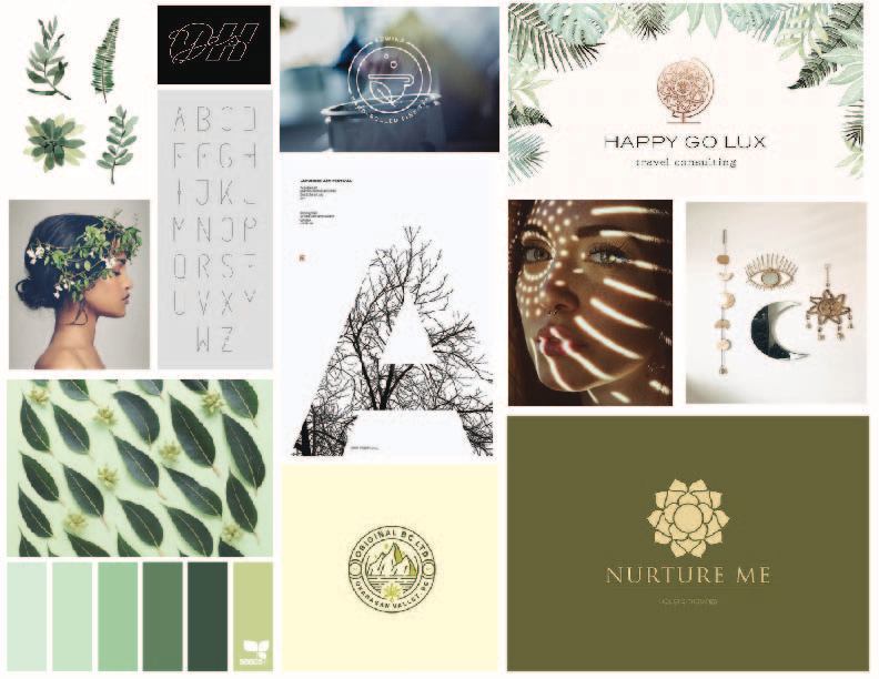 I love love love neutral and green tones! I also like very simple but interesting type logos. I also enjoy simple, line-type fonts. I really want to include some sort of leaf or sun into my logo; something earthy! It has been struggle to figure out what type I want included. I'm not sure if I want to use my full name, first and middle names, or just my initials. This is a very very challenging process!!
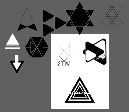 While creating these I was trying to visualize what it would look like with and without text and on in various other forms to try to get into the mindset! I was also trying to pin point things I like and dislike, in order to come up with ideas for my own branding. For example I was really feeling a logo that is simply constructed with lines more than bold shapes. It is also very difficult for me to find typefaces that I feel are perfect. The more I look at the types I chose the more I want to change them haha! Overall I am very excited to start work on my own branding and logo!!!
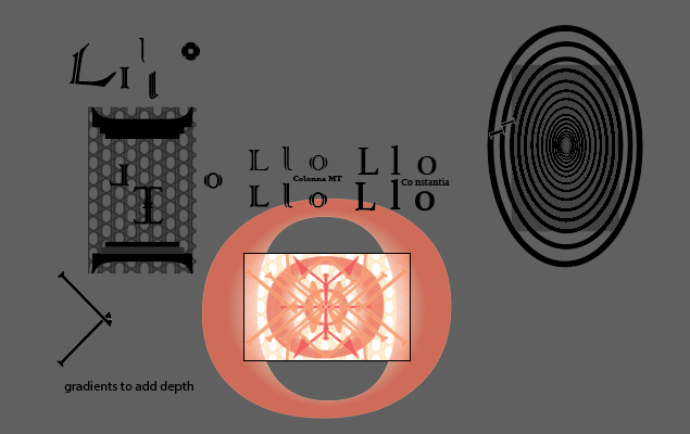 This project really challenged me, wow!! Coming up with my final concept was quite the process. I want to work on the idea of depth a little bit more. I think it's there but you kind of have to look for it. Yesterday I wasn't given any comments about depth or hierarchy so it became pretty clear that my feelings about those two concepts in this work are true. My partner for the critique and I decided that I maybe should accentuate the gradients or even to add more to help with the depth. Also, although the comments I got were that my color unity stood out, I began to like classmate's ideas of color more. Looking at my peer's pieces gave me ideas about creating color palettes that aren't so monochromatic. I love a monochromatic color palettes but I think more different colors could help to create more hierarchy!
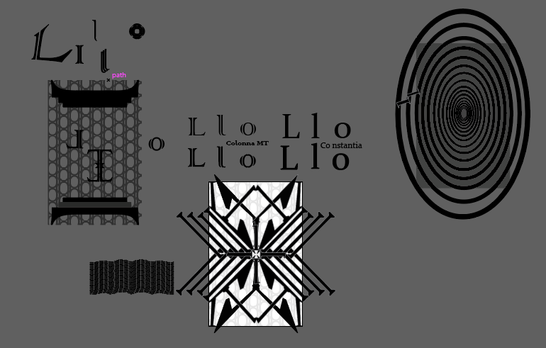 This project has been SO difficult for me! As you can see in the photo I have gone through many many designs and concepts. Despite this I think I am finally on the path to creating something I like. I really like using the letter and number I chose because they are very different, but simple, which makes it easy to create a lot of different things. By using subtle stroke I am working on creating the three different layers within the piece; it's coming along! There is a lot going on in the piece right now but I think eventually it will become more coherent and pleasing to look at.
  I liked making the gif! It was really fun to create something different and dynamic. It was also cool to learn new things about photoshop like how to create an animation. It was difficult to create a smooth image and tedious to create and save so many frames. Despite this I think it was a really good learning experience!!
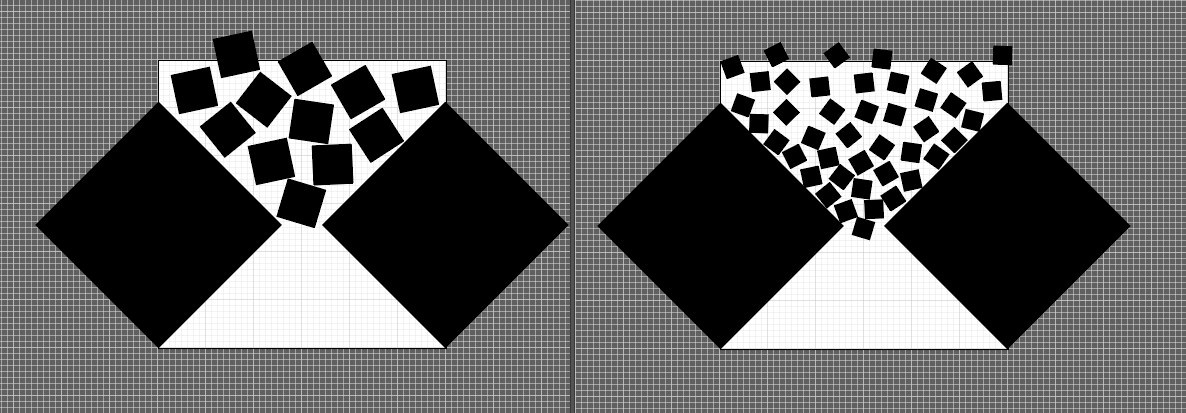 When we did the critique in class, this square was perceived as both tension and playful. It seemed as if the playfulness was coming from the focus on the tilting squares in the center. It was suggested that I modify how the squares look to help bring more tension into the image. I decided that I would try to give the image more of an hourglass-esque type of look. To do this I increased the amount of squares and made them much smaller to appear more like sand falling through the space in between the larger squares!
|